Ovenmate is an exploration of how I could solve a real life problem with a UX solution. Cooking is an essential part of everyone’s lives no matter their age, and many often find themselves cooking a recipe to death but not wanting to put in the effort to find a decent new one. For younger chefs especially, cooking and finding recipes is often a tedious task and is not an experience they can easily do with friends on a regular basis. Ovenmate is an app that I created to help streamline the recipe finding process and bring back the social aspect of finding and sharing recipes from before the digital era. The app lets you follow your friends and see what recipes they’ve favorited or made, as well as creating a space where you can effortlessly communicate with other users about the recipes. Users can follow their favorite chefs and curate collections of recipes they find interesting. Instead of dealing with endless food blogs and recipes that really only look good on camera, users can get recommendations from people they know and trust all on an app that prioritizes simplicity and community.
Art Direction:
Abby Guido
BRANDING
UX/UI
RESEARCH
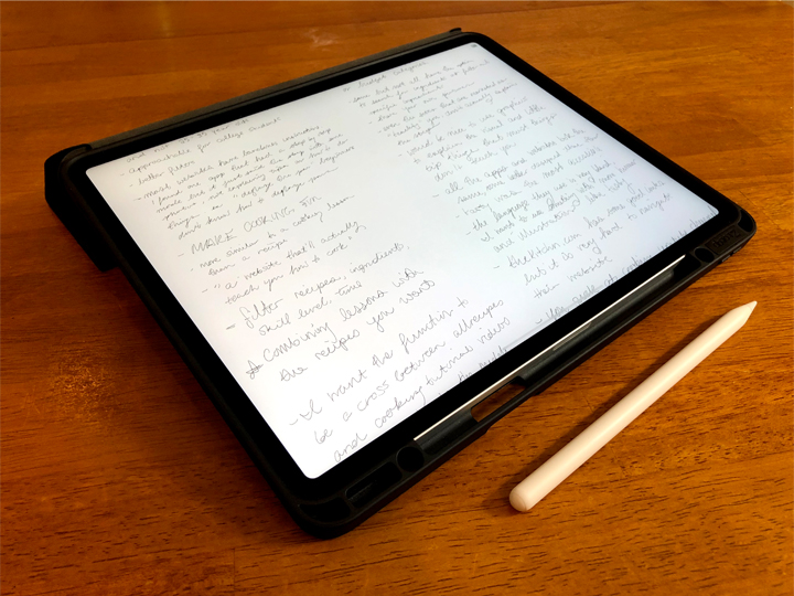
The first step of this research was to understand what ways people were currently finding new recipes and what was lacking. I interviewed people from many demographics, primarily those aged 18-25, 25-35. and 35-50. Many responded they either used Facebook, Pinterest, Tasty, or Youtube but rarely received recommendations from their friends. Their pain-points included frustration with cluttered blog sites, unreliable recipe reviews, and a lack of an algorithm that could recommend them recipes that would actually appeal to them.
I also looked into other existing recipe websites and apps to see what functions each site and app offered to users. Companies like Allrecipes, Tasty, Delish, and Epicurious ruled the game. Each archive provided the similar “search, scroll, save” function with small variations on each app/website. I found that there was a lack of support among many of the apps for inexperienced chefs, aside from Tasty, and that adding helpful tips, definitions, and guided recipes could help draw in a younger demographic.
SKETCHES, CARD SORTING, AND PROTOTYPING
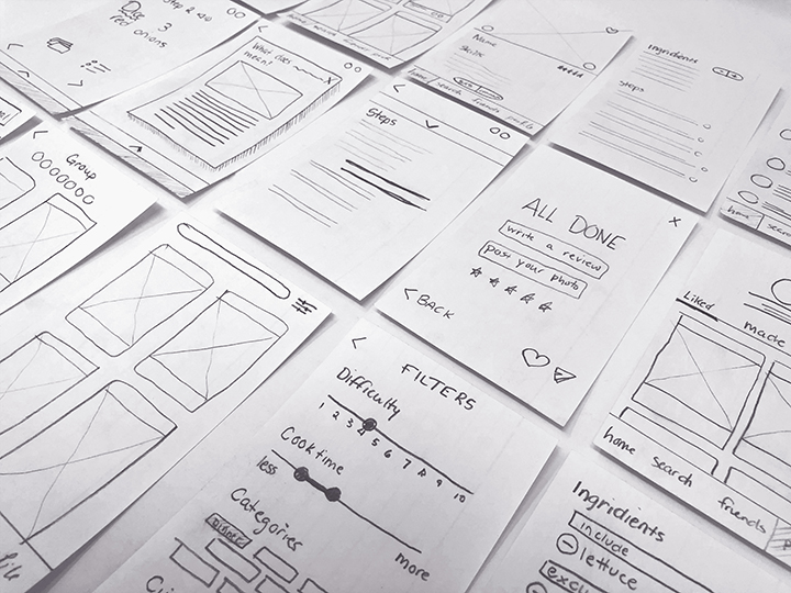
The first step of building the app was to determine its functions and hierarchy. I began by brainstorming all the possible pages and functions of the app and writing them down on post-it notes. I had my peers sort the notes to find a logical arrangement for each section of the app. This translated into the sitemap and potential user journeys.
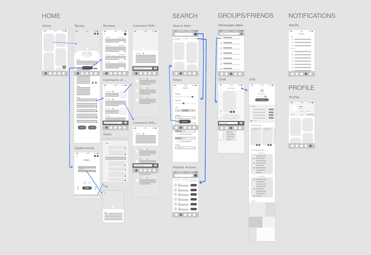
Next I began sketching each page of the app on notecards and laying out possible ways the content could be laid out on each page. I made edits to the overall architecture again with the paper prototype. I then made this into a digital wireframe to test the functionality and the flow of each page with some users. Again, some things were changed in this stage, including combining two high-level pages together.
BRANDING
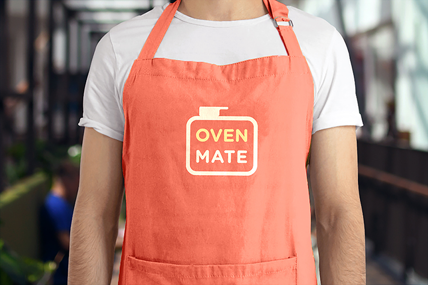
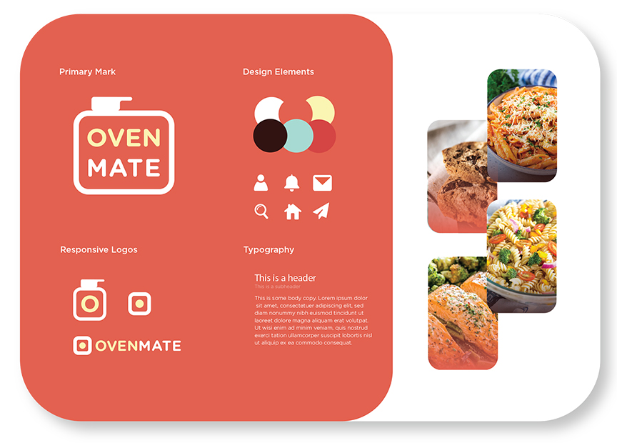
Research and development for the visual identity of the brand began with logo research and analysis of the competition. Online recipe resources usually come in the form of either a website, an app or both. The majority of brands utilized warm colors, with only a few outliers.
I looked at the designs for major social media apps and decided I wanted to keep my logo very clean and simple. The logo started as quick pencil sketches and mock-ups in Illustrator and eventually developed into a rounded rectangular form meant to mimic the shape of an oven. A pot was added on the top of the stove to give more context and interest to the logo.
The logo uses Gotham Rounded and the typeface for the rest of the identity is normal Gotham. The colors for the brand were based on a warmer color palette after some research showed that reds and yellows stimulated viewer’s minds in a way that is beneficial for food-related brands.
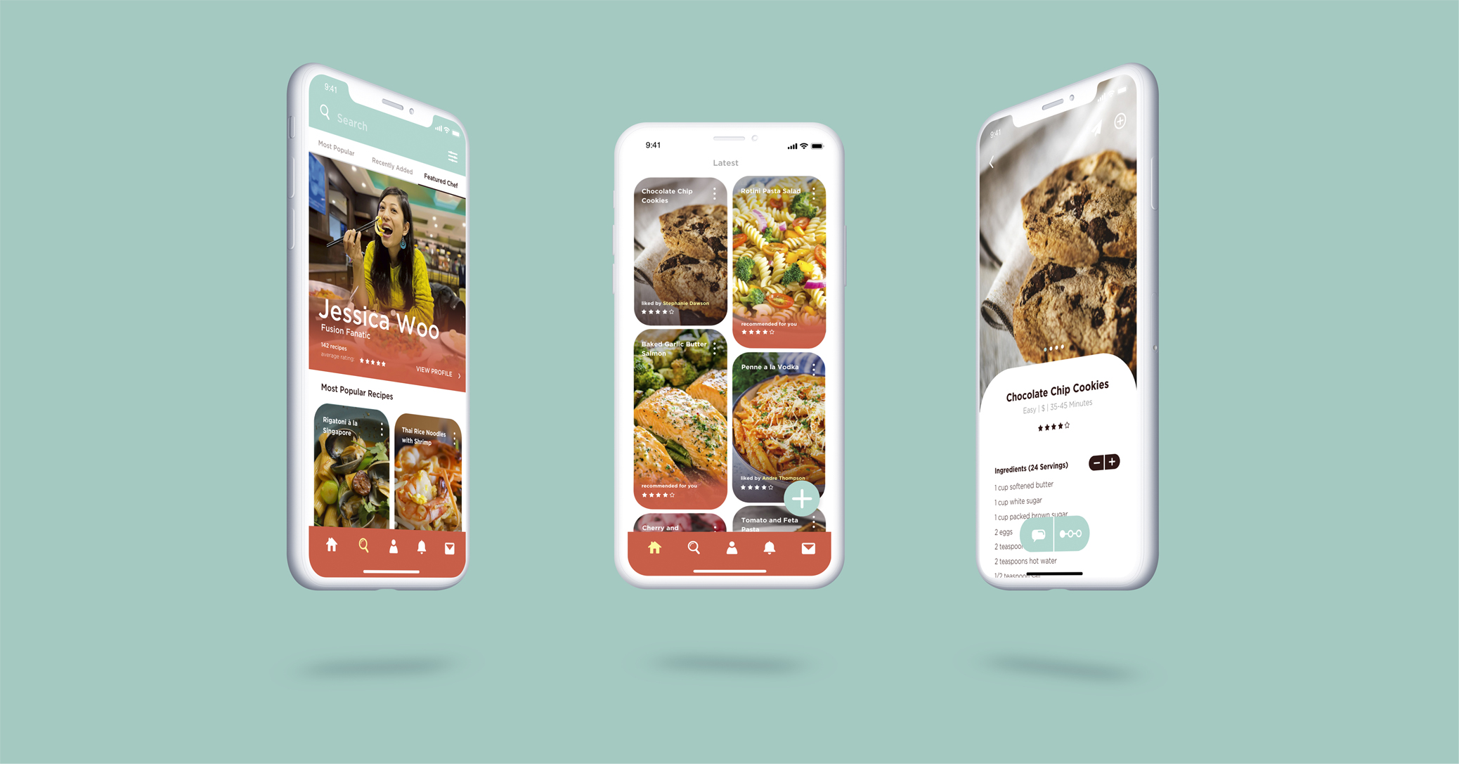
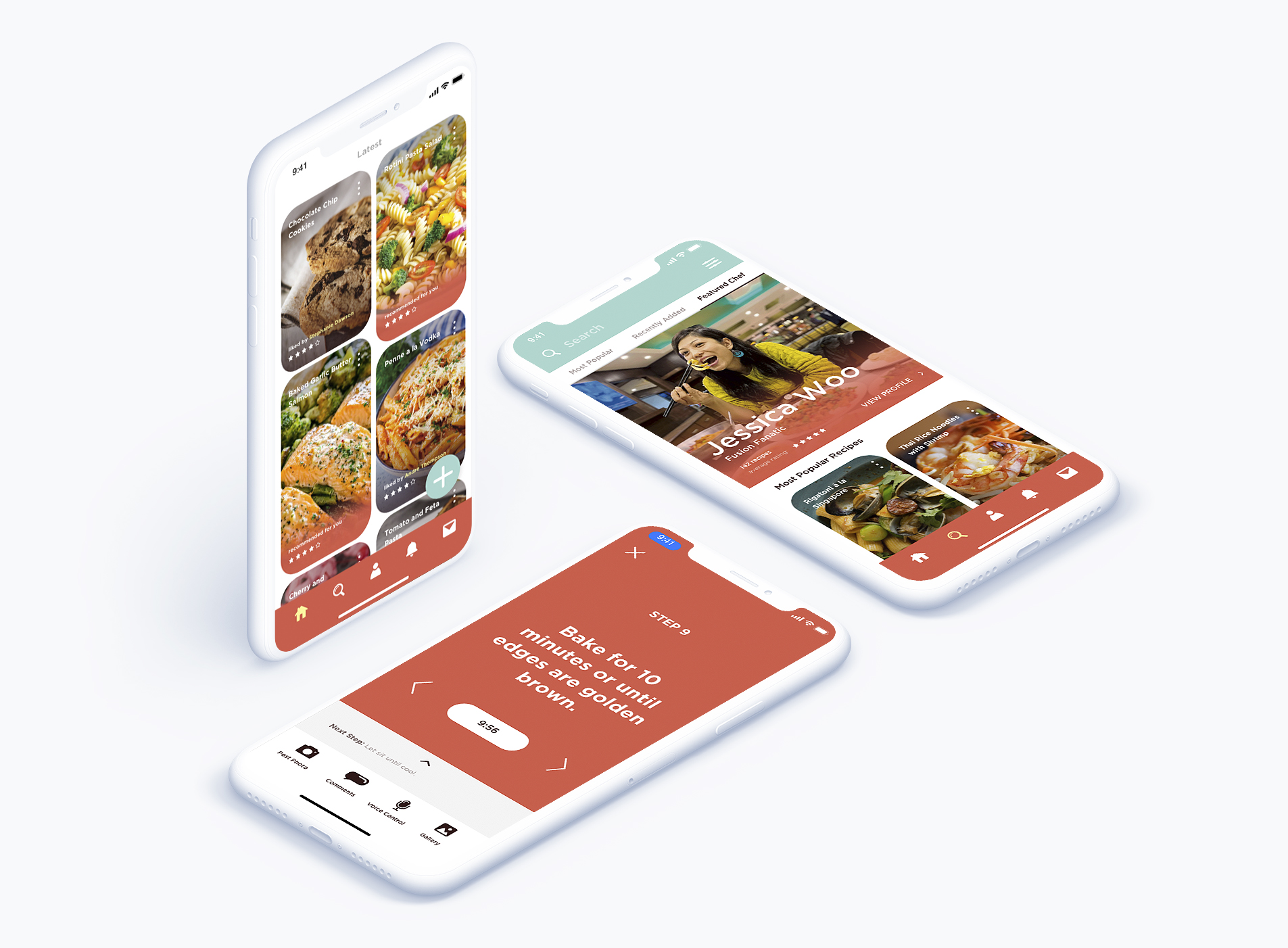
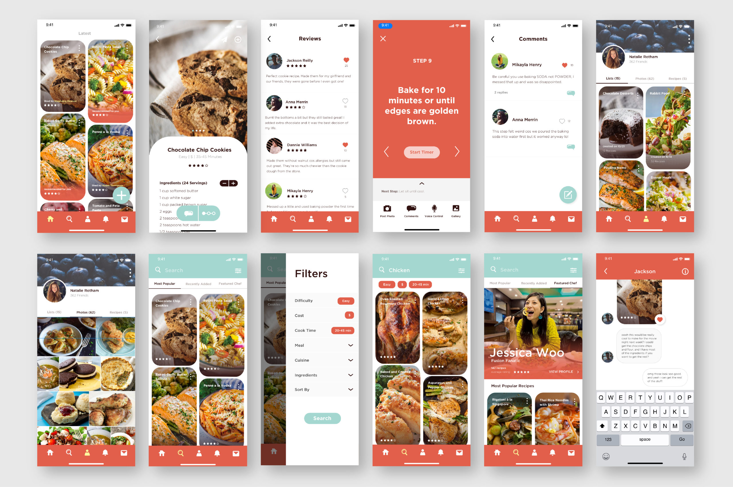
INTERFACE
The interface for the app is very image-focused, with a dual column layout for the endless scroll homepage and search pages. The images and icons all have clean rounded corners to carry the style established by the logo throughout the app. Each photo has a minimal amount of type and icons in order to give priority to the recipe being shown. The colors for the interface are primarily white, with bars and accents of red, blue, and dark brown. To allow for visibility of the text over the image, subtle gradient overlays are used on the majority of images.
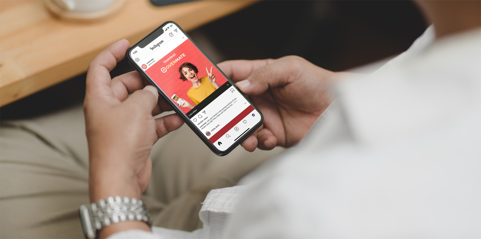
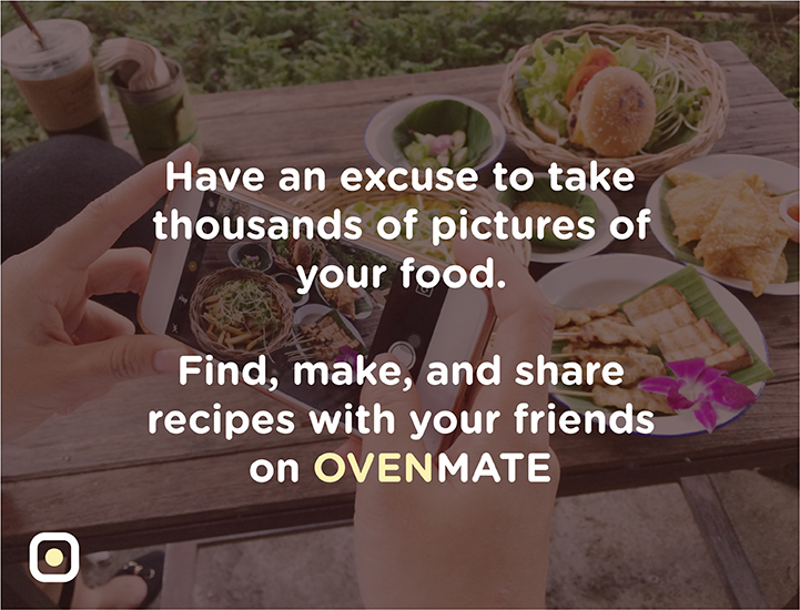
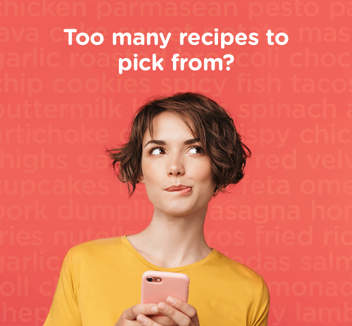
PROMOTIONS AND COLLATERAL
As an app whose target audience are those who like to share posts and connect with people online, I decided to design promotional material made for websites and social media. The attitude of the app is fun and fresh so the concept for the advertisements was to utilize short quips and bright colors. The ads are visually eye-catching with lively photographs and color fields, and the witty tag lines help to attract young and active users.