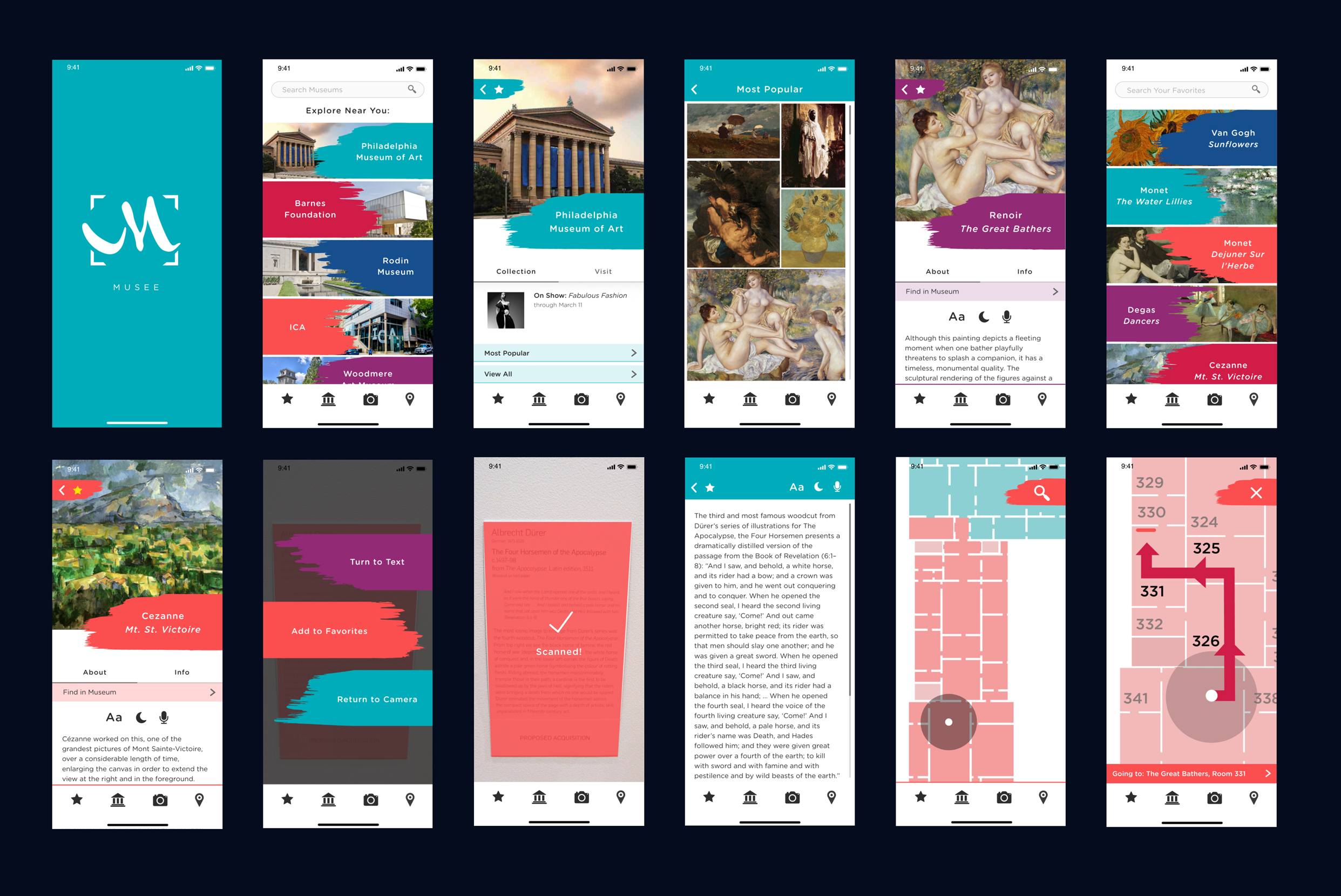
Musee started from a prompt to create a UX solution for people who are visually impaired but can still be used by people with non-impaired vision. This app addresses issues that people often encounter when planning to visit and actually visiting a museum. Whether you are traveling to a new city or visiting one on your own turf, Musee is there to help find local museums, preview their collection so you can make sure you’re seeing the pieces you want to see, and can guide you through the museum right to the pieces you want. To help those who have a hard time reading the plaques, whether because it is too small or too crowded, the app lets you scan the text and convert it to manipulatable text on your phone. The name “Musee” comes from a combination of the words “Museum” and “See”, and it’s also the french word for museum.
Art Direction:
Scott Laserow
BRANDING
UX/UI

RESEARCH
The first step was to research the different types of visual impairments and what can be done to accommodate for them. Ranging from color blindness, to low vision, to legal blindness, different impairments call for different solutions. I decided to tackle an issue that people with difficulty reading text and using way-finding.
There are many different ways developers and designers modify their apps to allow for accessibility, and I found that dynamic text, dark mode, and not using color as an important indicator were three that I saw to be the most important to include throughout my app.
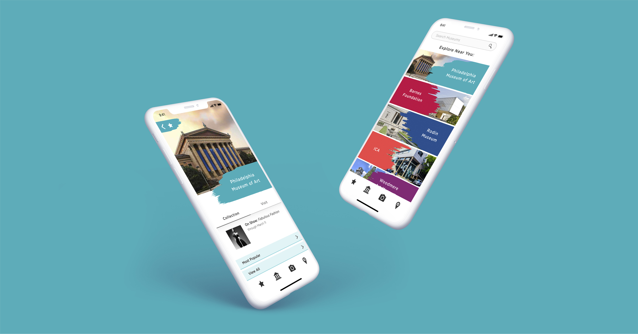
In the context of a trip to a museum, I found a few obstacles that people with impairments face that could potentially be aided by an app. The plaques at each piece were often in type that is too small for someone with low vision to read, and with how long it takes to read it, they could end up blocking quite a lot of people from also being able to read it. By using the camera, users can scan the plaque and make the text as large as they need right on their phone. Users can also preview what is in the museum and plan out their route beforehand in order to cut down the time it takes to navigate the maze of rooms in the museums.
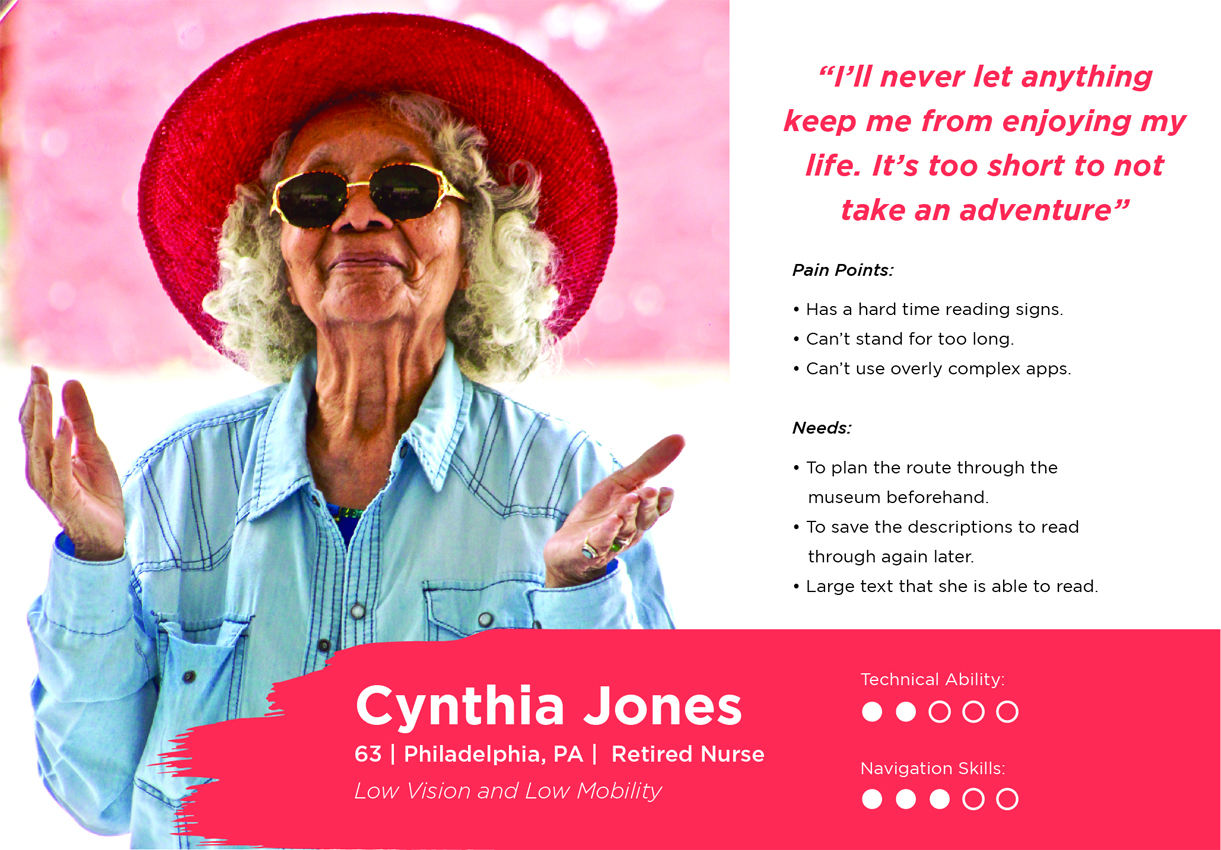
PERSONAS AND USERS
While the app is meant to help those with low vision, it also has feature that can appeal to anyone regardless of their vision. Users of any demographic can use the app to find museums to explore, learn more about their collection, and navigate the museum. While the scanner was included as an aid to those who are unable to read the plaque unassisted, it can also be useful for people who may not feel comfortable blocking the view for others, or when visiting a piece that is too crowded to linger long enough to read it. Through my research I found that it is helpful for products meant for the disabled to also appeal to abled people so that it’s consumer base is large enough to sustain the product. Therefore, the target audience for the app is a wide range, including people with and without impairments and of all ages.
SKETCHES AND PROTOTYPE
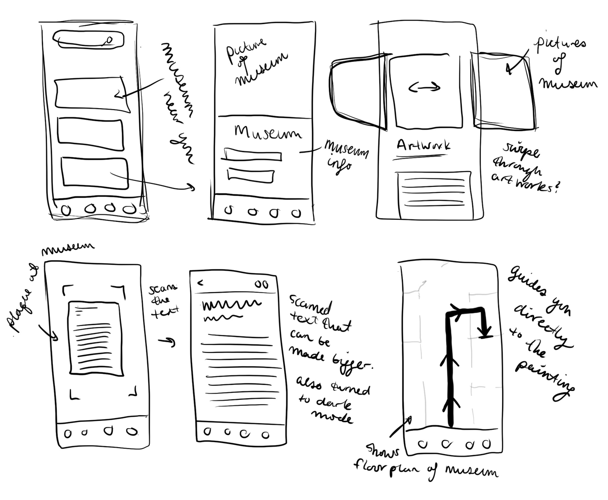
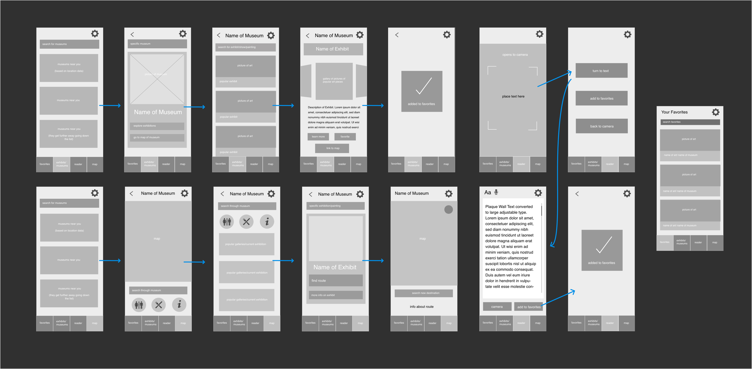
For an app with so many features and functions, it was important to spend a lot of time laying out the pages and overall flow. I began by using my research and ideas to brainstorm the different features and functions of the app and group them together by category. At this point of the project, I was collaborating with a team of my peers to develop the app and we worked together to make sure the architecture of the content made sense.
After putting those ideas onto paper and sketching out the pages of the app, I made a rough wireframe. The wireframe helped us visualize the hierarchy of the content and how each page would function. It also forced us to start thinking about how big everything needed to be in order to be visible and how to add the controls for the accessible features.
BRANDING
The logo for the app is a reference to the original purpose of the app, which is the scanner to help the visually impaired. Because the app is focuses on art museums, I used the Ms from several famous painter’s signature to represent the art that is being scanned. The primary mark has the M from Claude Monet’s signature.
The colors used are rich with high contrast but are not used in a way that it is necessary to differentiate between them to navigate the app. The shades are bright and playful, providing an approachable and inviting feel for the users.
The icons used throughout the app as well as much of the type is very soft and rounded in order to make the app feel less stiff.
The brushstrokes used throughout the app add a unique and fun twist to the normal bars running across our screens. They emphasize the focus on art and make the interface stand out amongst the more rigid and less playful museum apps and apps meant for the visually impaired.
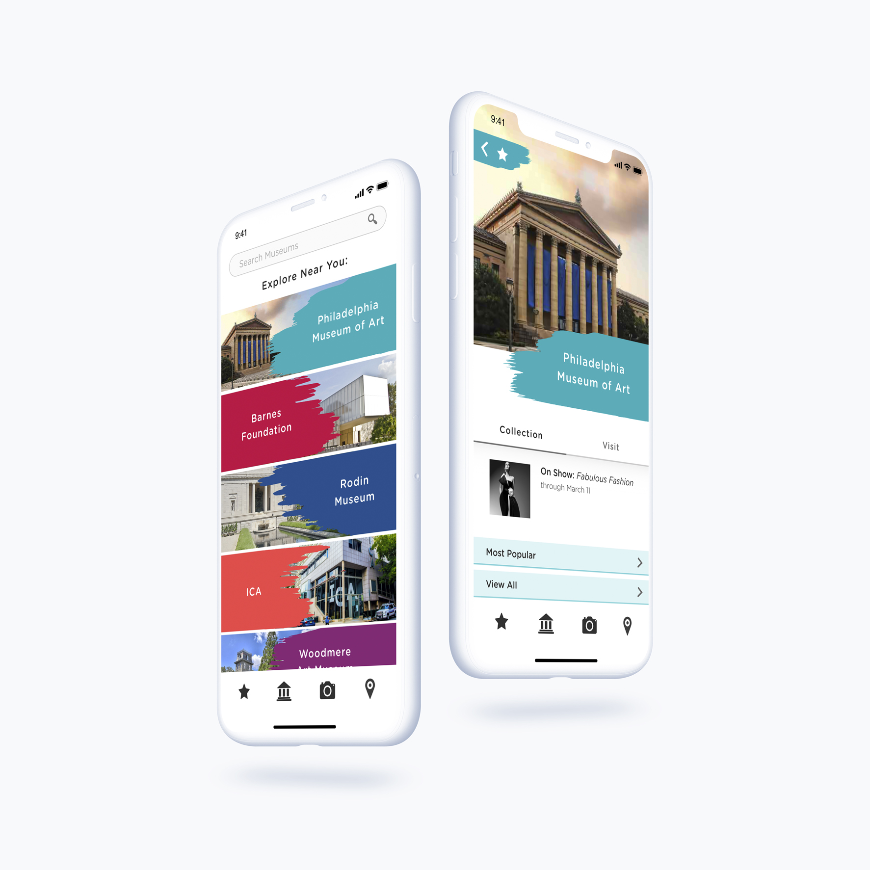
INTERFACE
The interface for the Musee is filled with colors and pictures but is balanced to make sure it is not too busy or overcrowded. The designs work with many different point sizes to allow for dynamic and enlarged type, as well as including controls to adjust the type for any page with lots of text. The entire app works in both day mode and night mode to allow for higher visibility. All the type is sans-serif, and is only ever put on a solid background, never over an image. There are no gradients and all controls are visible.
Users can set up their type and color preferences when they first sign up and it can be adjusted at multiple points throughout the app. The brush strokes, as mentioned before, add special interest to the app and carry the “art” theme through each page.