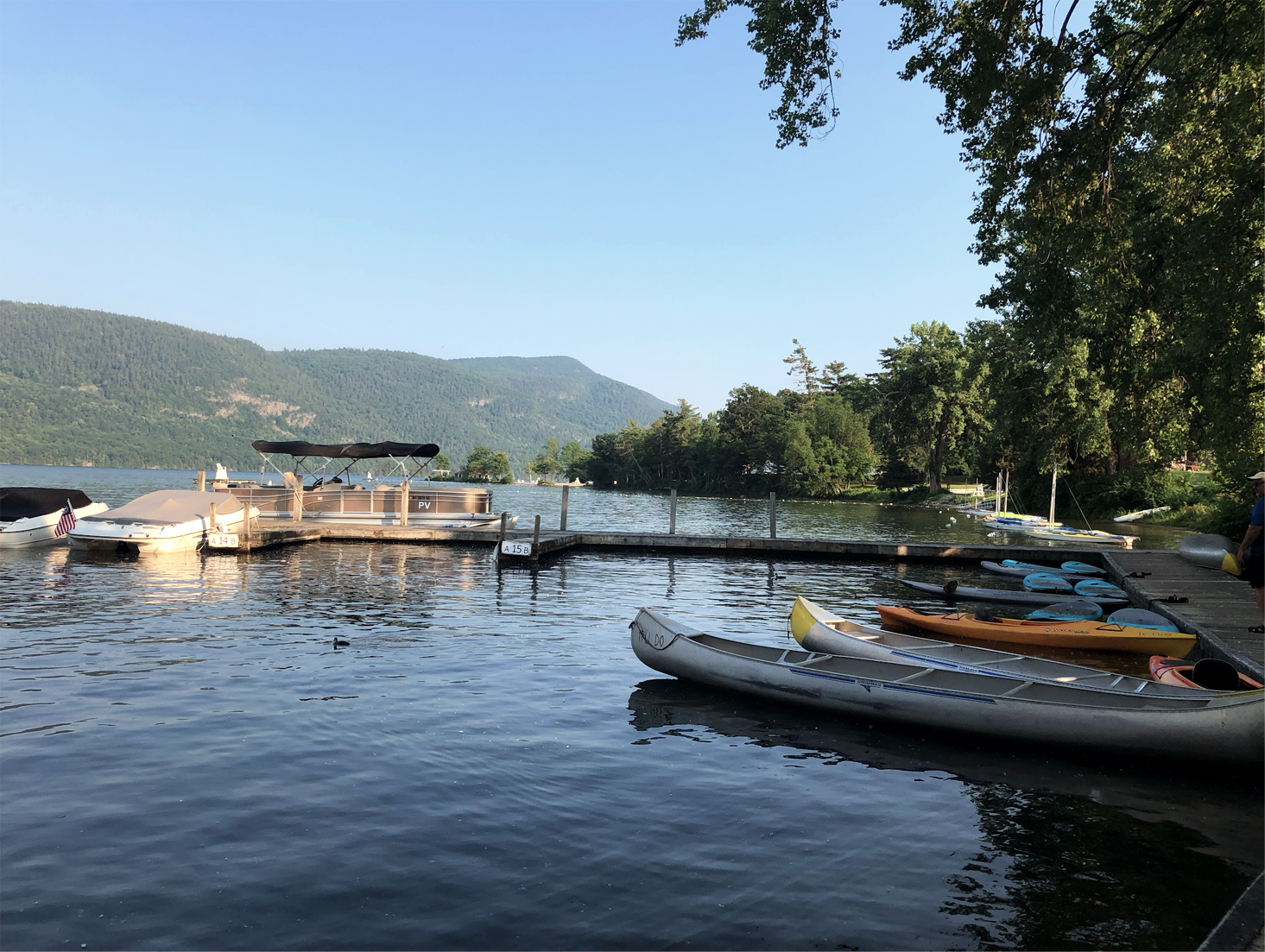
Lake George is a spring-fed lake nestled in the Adirondack Mountains of Upstate New York. It’s hailed as one of the cleanest lakes in the United States and its commercial southern region is a popular vacation destination for many New Yorkers. My family has been spending our summers on the northern end of Lake George since far before I was born, and its mountains and shores have a permanent spot in my heart. But my memories and experiences of Lake George are far from what the average tourist experiences. While Lake George Village is a bustling tourist attraction, the northern side of the lake, home to peaceful islands, incredible trails, and scenic campgrounds, is often left behind for the resorts, amusement parks, and shops of the south. I wanted to give the often underpromoted parts of Lake George a chance to shine and create a new identity for the northern half of the lake. By promoting the outdoor attractions and advertising to an audience looking for a vacation off the beaten path, this new Lake George brand is filled with adventure, relaxation, and a breath of fresh air.
Art Direction:
Abby Guido
BRANDING
UX/UI
ADVERTISING
RESEARCH
Lake George is a region filled with activities ranging from ziplines and parasailing to dinner cruises and tours of Revolutionary War Forts. With so much to offer, the current approach for promoting and branding Lake George takes a very flexible and safe approach. While it appeals to visitors with families and the elderly, it doesn’t resonate as well with Millenials and Gen Z. Research has shown that the latter two groups currently make up the largest majority of people taking vacations, and they’re most likely to spend that time in the wilderness. Gen Z especially has been seen as a group whose ideal vacation is rustic, cost-efficient, and as non-commercial as possible. This research presents an opportunity to take advantage of the natural attractions of Lake George and to market to a new and growing demographic.
BRANDING
I approached this rebrand with three goals: to ensure that Lake George stands out from the other lakes in the region, to appeal to the younger generation’s sensibilities for authenticity and uniqueness, and to create an identity that conveys the beauty and adventure that Lake George holds. I began by auditing the identities of rival lakes in Upstate New York, as well as successful identities from around the country. As expected, most lakes in the area don’t have a modern and robust brand identity, and most are targeted towards a similar demographic as Lake George. Other destination brandings from around the country, such as Lake Tahoe and the State of Oregon, provided inspiration for how to create a fresh look for the lake.
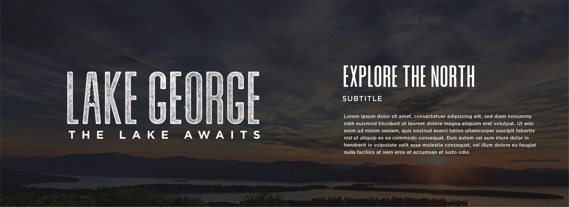
I wanted the logo to include a direct connection to nature while having a rustic feel. The rough texture and the hidden tree inside the A give the logo a weathered look with a hint of the never-ending forests that surround the lake. I decided on “The Lake Awaits” for the tagline as it evokes a sense of adventure and intrigue to pique people’s interest.
WEBSITE
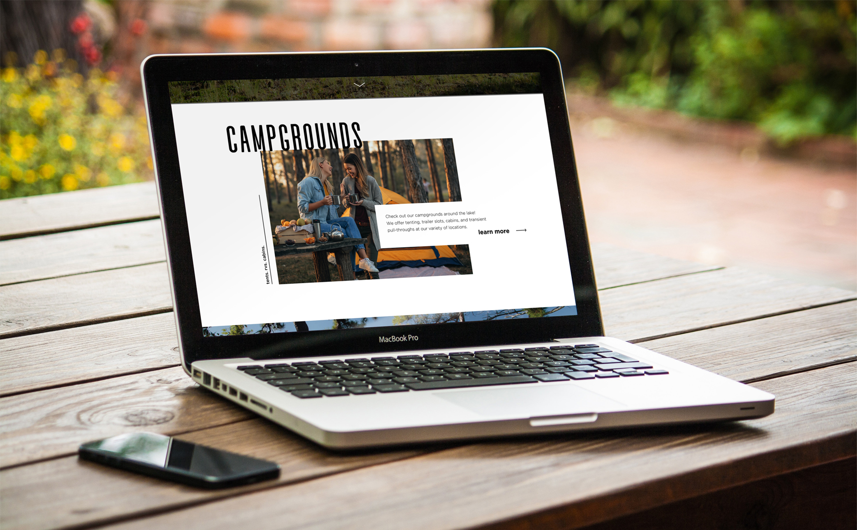
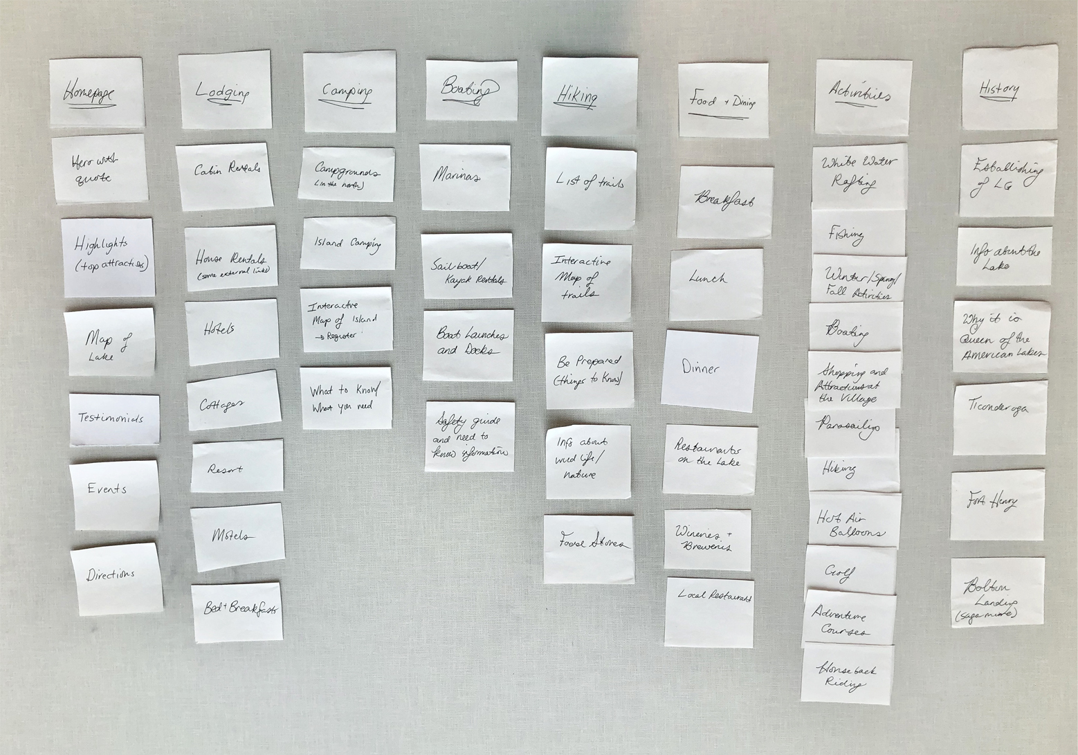
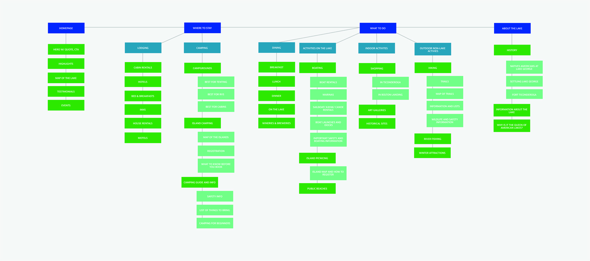
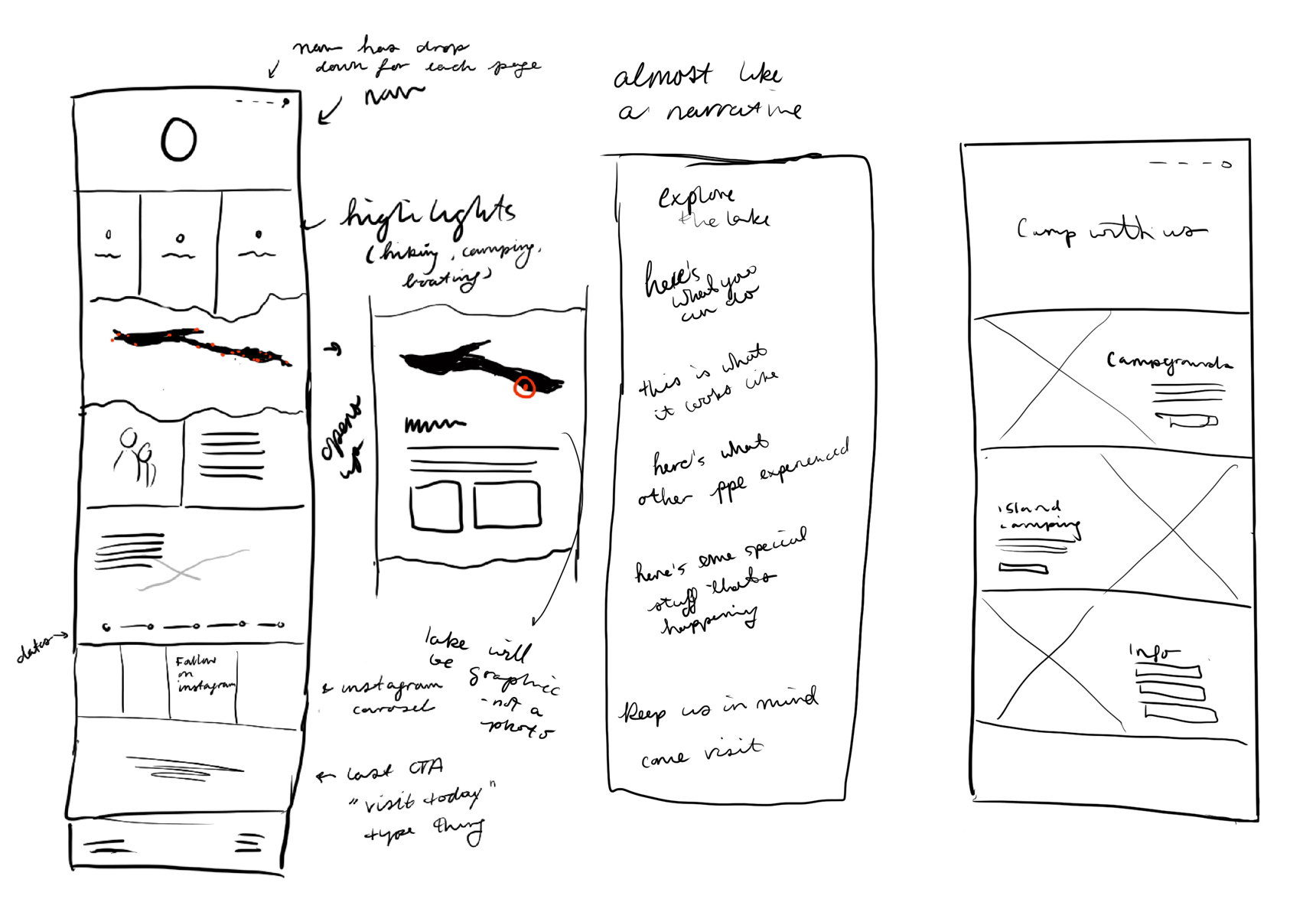
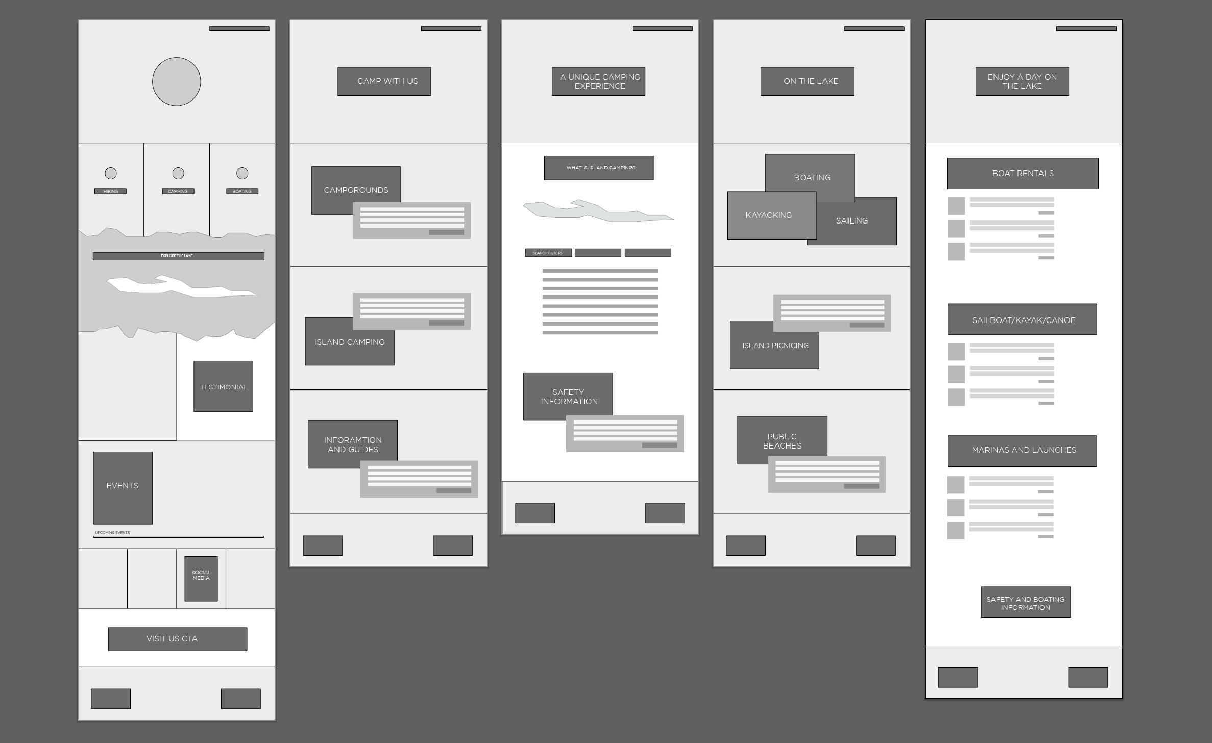
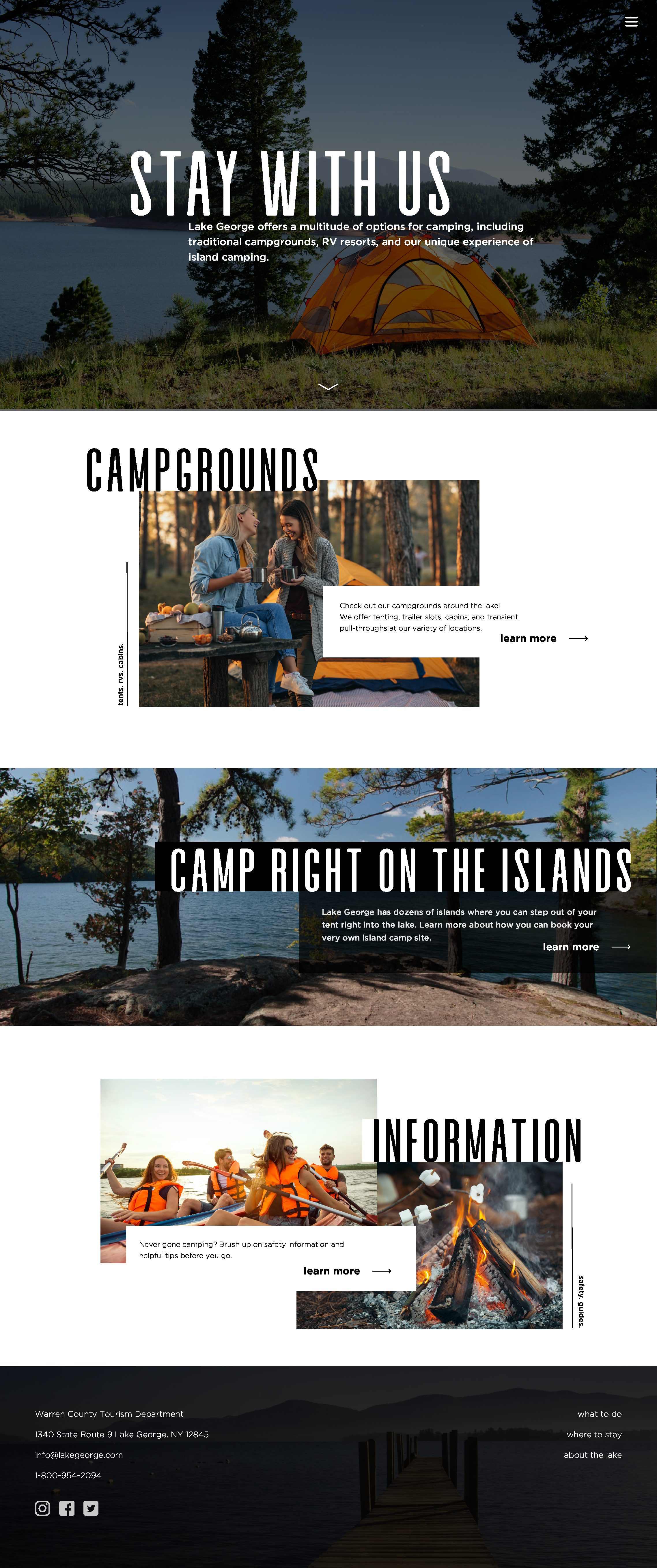
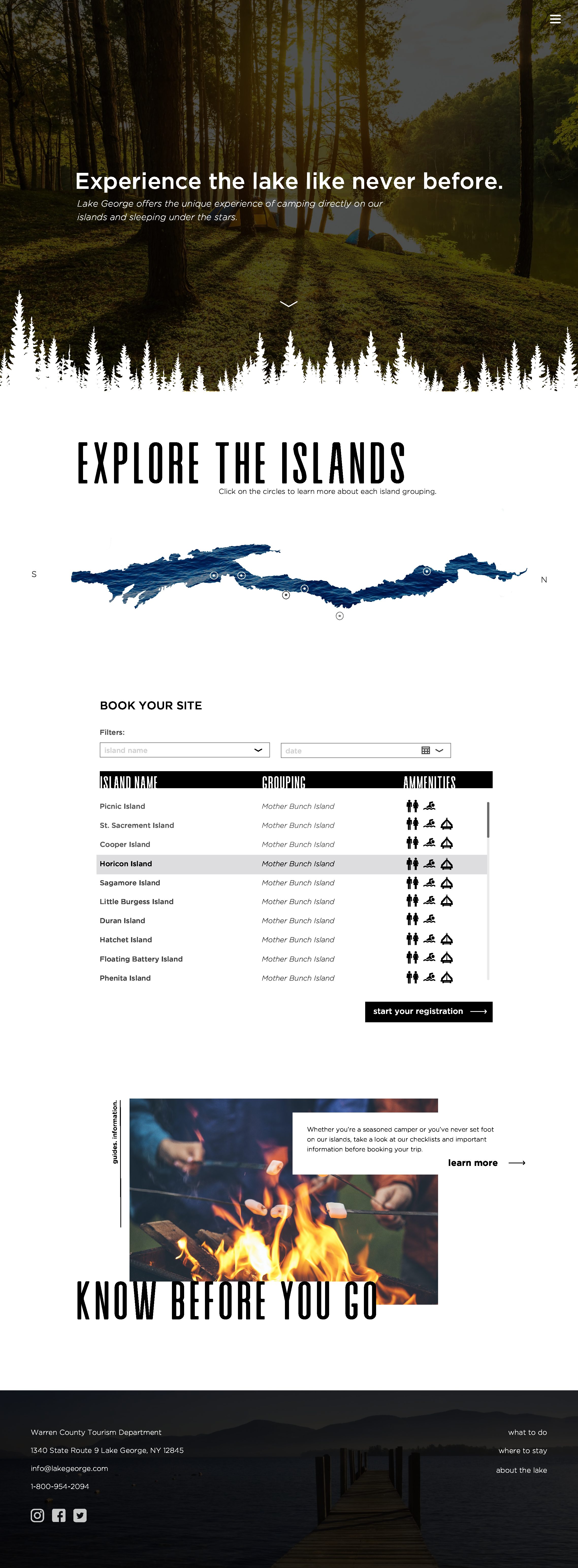
While researching the ins and outs of destination branding and marketing, I found that the most important part of the design is the website. The website is the most common touchpoint for new visitors and a well designed and well functioning website has proven to drive up numbers by a large margin. With so many things to do at the lake, and so much information to provide for users, my first step with the website was to research everything that needed to be on the site and what I wanted to emphasize to new visitors about the lake. I wrote everything down on small pieces of paper and started to organize them by category. After determining the over architecture of the information on the site using the cards, I created a digital site map and moved things around even further. I broke the highest level of the site into three parts, whereto stay, what to do, and about the lake. I chose which pages to include in my user journey, sketched out a rough layout of the pages, and created a lowfi digital wireframe for the pages I wanted to design.
INTERFACE
Lake George is a beautiful and photogenic region so I wanted the website to highlight those images. Websites meant to advertise a destination or a vacation are already heavily photo based so I made sure to follow that lead with the interface for my website. The large type grabs user’s attention and directs them to the information that they need on the website. I used the type overlapping the images to create interest on the pages and to guide the user’s eye around the pages. There are also two sections on the website where people can learn more about the different parts of the lake using an interactive map. Because people are highly likely to be viewing the website on their phone rather than a desktop, I also design the website for a mobile screen.
SOCIAL PRESENCE AND APPLICATION
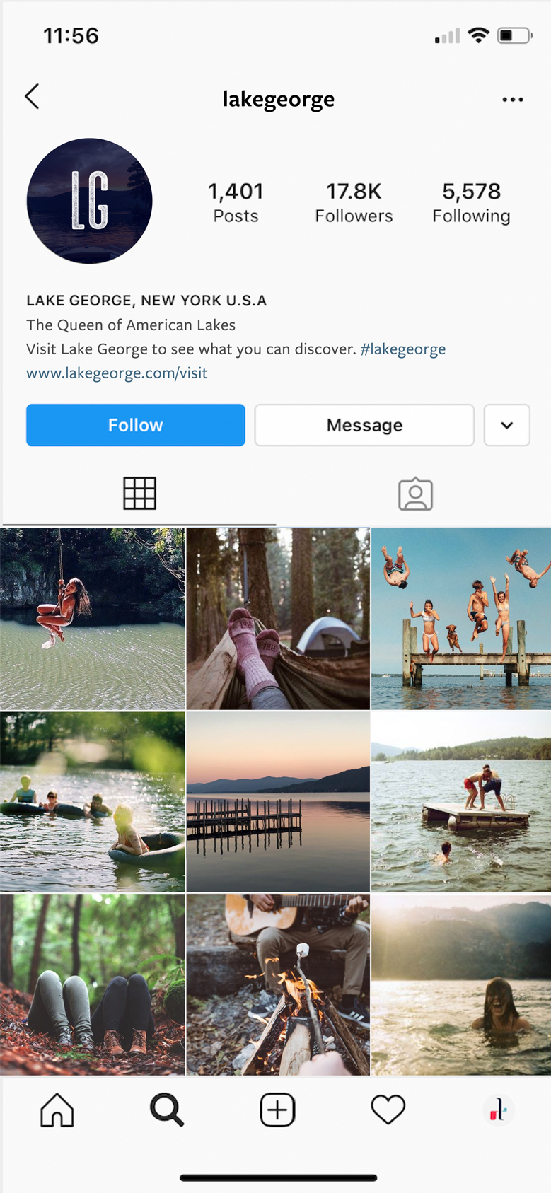
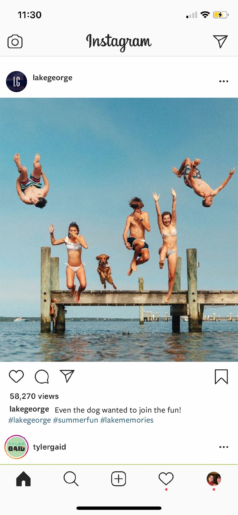
The demographics that I am targeting for this new identity also happens to be the demographics most heavily influenced by social media. To spread awareness and gain a following for the lake, I created some mockups for an Instagram profile and a post. This brand could benefit from a strong social media presence and posting not just aesthetic photos of the lake, but also lifestyle photography to inspire people to want to create their own memories at the lake.
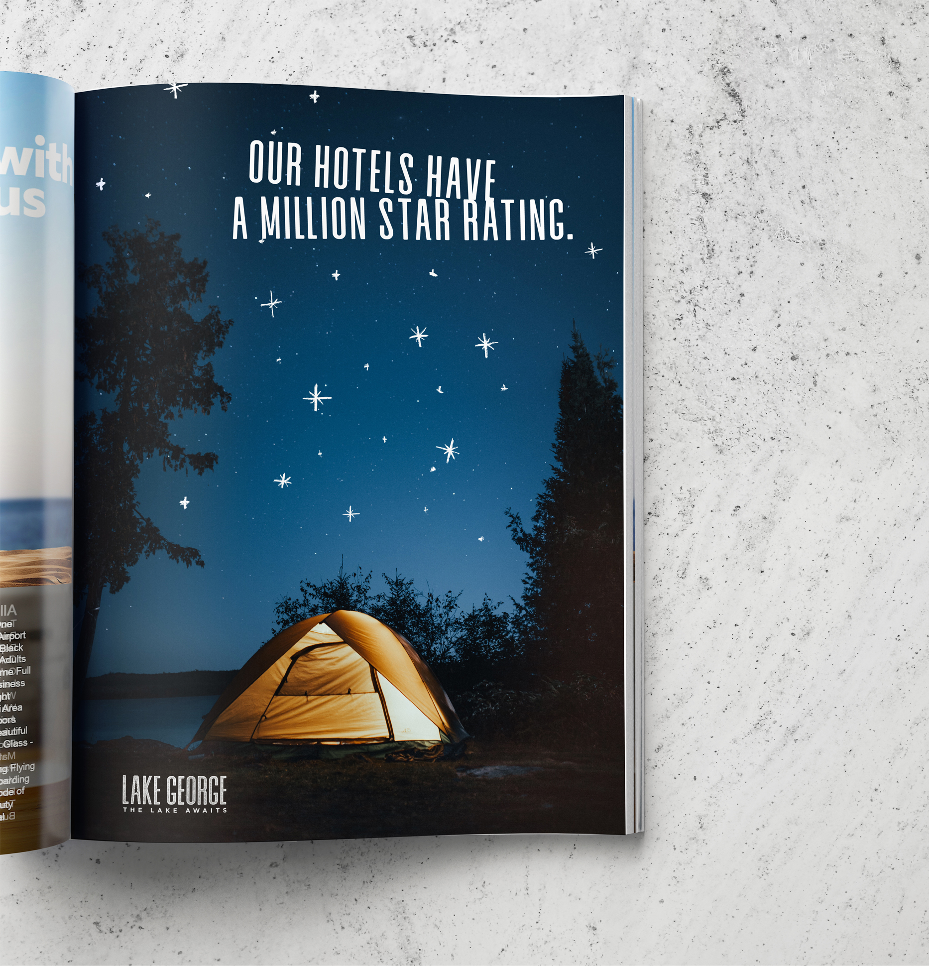
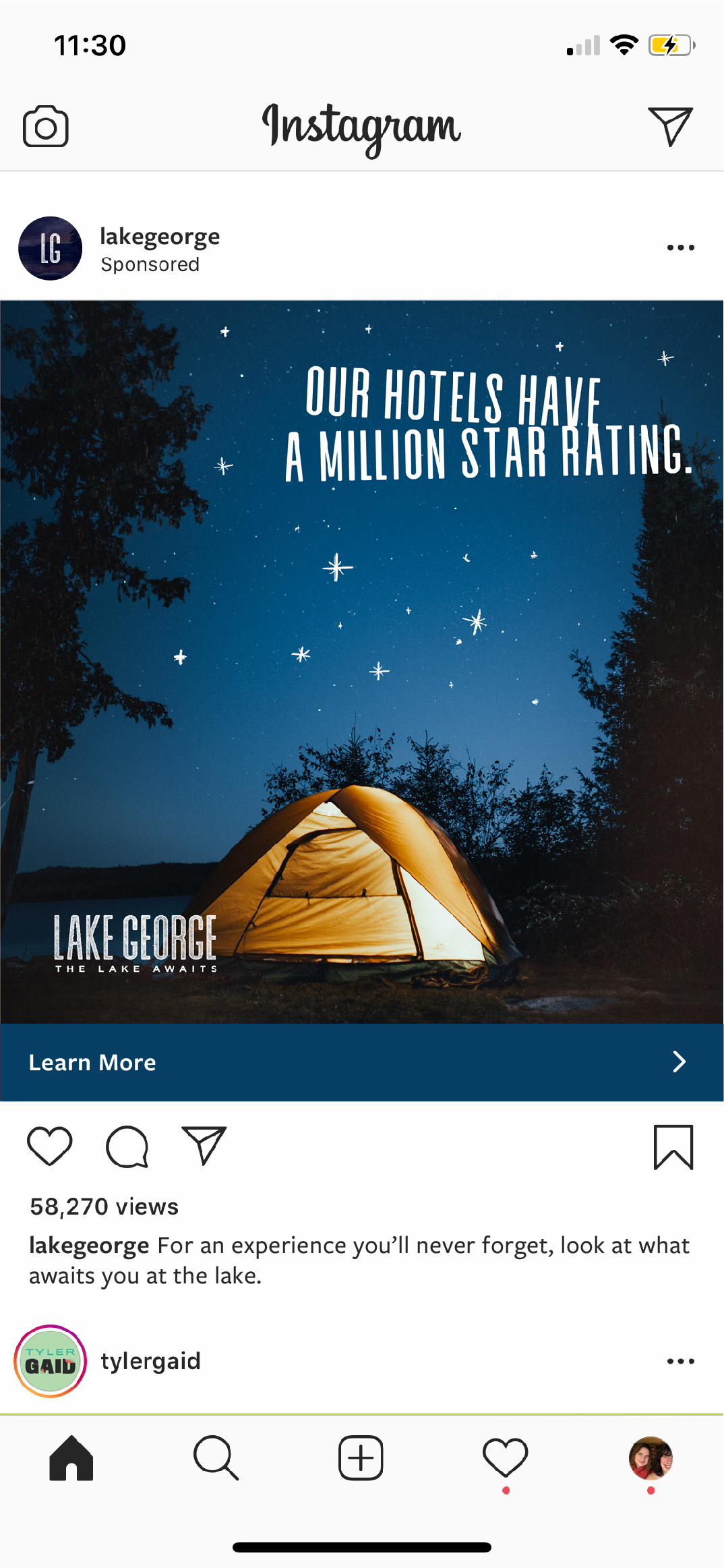
Besides managing a social media account, there is also the opportunity to advertise to users through the internet. I created an advertisement for social media (presented in the form of an Instagram ad), that shows off the fun attitude that the new identity has and incorporates imagery that catches users’ eyes while scrolling. The tone for future advertisements should be light-hearted, humorous, and evoke a sense of wanderlust. Hand-drawn illustrations on top of the photos give in a unique touch and reference the roughness of the logo.